Tuesday, August 31, 2010

Sundays Thought Provoking Project

About to embark on my very first foray into etching copper I was trying to think of something to quickly draw freehand onto a 3"x3" square of copper. I quickly discovered that drawing with a sharpie on copper is not like drawing on paper to begin with, so it was essential that I did something simple.

At the same time I wanted to find out how different things worked when being etched so it was essential that I experiment with both thick & thin lines. My brain drew a blank on what to do & after an hours spent searching for something online that I could draw ideas from I realised that I was being somewhat obsessive about it being a nice tidy, repetitive design. I quickly flicked through an old notebook & borrowed part of a tribal tattoo style doodle I had done a year or so back & filled the rest in with bit's & bob's all in the name of  'learning'.


I must say that at this point I thought ...well, I can't actually type here what I thought, suffice to say "Oh dear" is a gross understatement.


After it's spa trip into the acid bath, I pulled little 3x3 out & neutralised him. He wasn't looking very pretty, even after I scrubbed him up. Having no chemical patina products to use & decided that I'd hit him with a bit of torch flame as I knew that copper can produce some wonderful effects when exposed to heat.


Then it was time to have the raised area's cleaned. Now I could see every pen stroke, especially those that overlapped & left thicker area's of resist. I learned quite a bit about what technique is required when drawing on copper from this from this.


I also realised that when it's looked at as a whole, rather than the parts it will become, it's far easier to get hung up on the imperfections of a design.... &  finally I realised that those same imperfections will be far less noticeable in the end product.


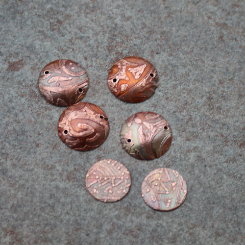
In fact the end product will do quite nicely for another project I have in mind. Something I have been meaning to "redo" for a few years now... &  it's not perfect either. Stay tuned for that one!

Sunday, August 29, 2010

Back To Basics

Back To Basics

Somewhere along the way I lost my draw, sketch & doodle gene. Not so many years ago no piece of paper was safe if it was within reach & I had a pen or pencil in my hand. I'm not particularly talented in the drawing or sketching department, although I could generally get onto paper a half decent representation of what I was trying to portray,  but I could always doodle up a storm as any old bill, phone book or piece of scrap paper used to be able to attest to.

As I was struggling to think of a design for a project today I wondered what had happened to the impromptu, unplanned art form of doodling & why it had all but disappeared from my life. Tonight, as I sat down to do something on the computer, the penny dropped. Technology is partially to blame.

Eleven years ago when I first got a computer I still did most things manually. Somewhere along the way it was suggested that we were heading towards a paperless society - my brain must have absorbed that idea, taken it & run with it.
Instead of hand drafting patterns I'd do it on my computer & then take them to be enlarged at a copy shop. When it came to patchwork or Cross Stitch I had design programs for those. Rather than draw a rough plan to map out an idea on paper, I'd open Smart Draw & do it tidily, precisely & to scale. Now I pay my bills, that arrive via email, online & if I want to find out where to get something locally I look online rather than use the phone & ring around. I used to doodle all the time when I was 'on hold' during phone calls.

Worst of all if I had a rough design in mind for something I wanted to do, be it knitting, needlework or a painting for the kids room, I'd search online to get inspiration rather than slog it out in a sketch book trying to get the idea in my head to look right on paper. 

You can see where this is going - in short my imagination has gone into hibernation. I realised today when I had to search through an old notebook, because I knew there was a doodle in there somewhere that would at least give me a starting place for something I could do on the small blank canvas I had before me, that I don't think in pictures any more.

My brain doesn't have to think in pictures because everything is out there at the touch of a button....or at least the typing of a few specific keywords into a search engine & you have instant visual overload.

A classic case of  "use it or lose it". I dont believe that I have completely lost it, but I suspect that I am going to have to retrain myself somewhat - & take a step back from my friendship with google ;)

It's time to play again - with pencil, pen, paper & my imagination. Time to back off from ease of access & get back to basics.

Monday, August 16, 2010

Water

A couple of months back I sat down to test two glass colours, or more specifically compare them. There appeared to be very little difference between in rod form so I wondered how they would differ, if at all after being in the flame.

CiM's Mermaid was a breath of fresh air to me when it was released. Looking at the sample online I just knew that it was going to be a perfect match to the only shade of 'blue' (it is really teal but slightly more on the blue side) I like to wear these days. I can never find any clothing with that particular shade in it, aside from a favorite top I purchased a few years ago, so a nice necklace & bracelet will be the perfect accessories to pull in an idea I have centring around that colour.

Somewhere along the way I got carried away in my testing, pulling out rods of glass that I thought would be a shade lighter than the previous one until I got to the palest in what I had available & then I started on the blues.I stopped before I went through my complete palette of blue glasses realising that every colour I had used was a colour that I had seen water appear. From deep freshwater springs & tropical lagoons to huge bodies of ocean & inland lakes. Put together like this it really makes one realise what an amazing element water is.

Sea & Sky

Sunday, August 15, 2010

Winter has it's up side

but am I ever ready for Spring!

Yep I'm counting down the sleeps & it's only fifteen more until SPRING!!!

However with the arrival of spring there are some things I will miss. Whilst other plants slowly realise that the ground has become warm enough for them to blossom & burgeon forth, the wonderful Viola's & Pansies that have bloomed all through the winter, giving me those spots of colour out on the patio will be winding down after their showy performance.

Hopefully these two troopers that were planted a bit later will last for a while yet  as they have to be two of the nicest colour Viola's I have seen in recent years.

Tuesday, August 10, 2010

Defective Rain Stick

I have proof that rain sticks don't work! Well, not in the wrong hands & without the correct ceremony it appears.
A certain pre teen decided yesterday that she did not want to do sports today at school. Fair enough, it was an overcast, wet, cold & extremely miserable day. There was no reason to expect that today would be any nicer, but as an insurance policy of sorts she got out the lovely aboriginal rain stick we have & did a little dance with it.


You guessed it; today dawned bright & clear with not even a trace of the rain & grey clouds we had yesterday. The sun had some warmth in it & despite the snow on the Port Hills it was a lovely mild day.


Defective Rain Stick
Sure would make a great bead design though !!

Sunday, August 08, 2010

Pretty as a Peacock

I woke this morning to a wonderful conversation from an Etsy seller alerting me to the fact that she had included some of my beads in a Treasury.
What a fabulous Treasury it is & it certainly lives up to it's name. If you have time to look please click on the link below the Picture.

Treasuries are certainly a great way of discovering new artists on Etsy.  The work displayed is always tasteful, often tempting & without doubt totally inspirational.


Wednesday, August 04, 2010

Tropical Tastes

In the midst of winter, why is it that I find myself drawn to the cool spring & summer colours & combinations. Easy answer: because I only want to look forward.

Oh, & I'll admit that the tropics are always on my mind.